Creative · Dark · Modern · high energy
Framer
A dynamic, expressive and moody design system. Built on deep, dark surfaces. For creative tools. Bringing joy and approachability.
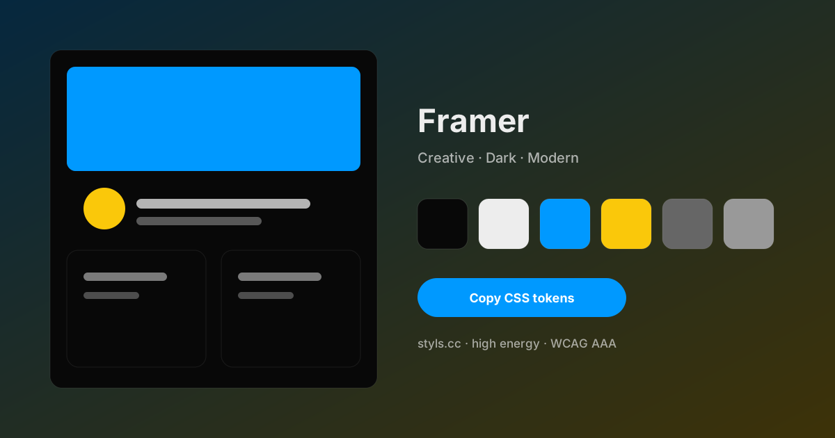
Framer color palette
6 design tokens with measured contrast against the #080808 background. Copy the hex values or the CSS below.
- #080808 Charcoal Canvas Background 1:1 · Decorative
- #ededed Deep Space Text primary 17.11:1 · AAA
- #0099ff Electric Blue Primary 6.68:1 · AA
- #fac80a Goldenrod Accent 12.71:1 · AAA
- #666666 Slate Dust Secondary 3.49:1 · AA large
- #999999 Ash Gray Border 7.03:1 · AAA
Accessibility
- WCAG AAA
- WCAG AA
- Color-blind safe
- Text on background: 17.11:1
Contrast improvements recommended
Emotion profile
- playfulness62
- energy55
- technical54
- trust45
- human43
- calm35
- luxury24
Do
- Use consistent spacing
- Follow brand typography guidelines
- Maintain color hierarchy
Don't
- Don't mix warm and cool tones excessively
- Avoid low contrast text
- Don't overcrowd the interface
Constraints
- Max 3 accent colors
- Dark backgrounds only
Anti-patterns
- Avoid pure black (#000) for text
- Don't use more than 3 accent colors
- Avoid white backgrounds
Prompt snippets for AI agents
Paste these into an AI design agent to reproduce the Framer look.
Design a creative dark interface using "Framer" style with clean typography and consistent spacing.Create landing page components with Framer color palette. Use #000000 as primary, #080808 as accent.Export Framer
:root {
  --background: #080808;
  --text-primary: #ededed;
  --primary: #0099ff;
  --accent: #fac80a;
  --secondary: #666666;
  --border: #999999;
}

/* Tailwind (theme.extend.colors) */
module.exports = {
  theme: { extend: { colors: {
    'background': '#080808',
    'text-primary': '#ededed',
    'primary': '#0099ff',
    'accent': '#fac80a',
    'secondary': '#666666',
    'border': '#999999',
  } } }
};
Best used for
Source: Framer · Confidence 100%
Related design themes
Apply Framer to a real project
Open the studio to preview every component, tune the tokens, and export CSS or a Tailwind config.
Open Framer in the Studio