Technical · Creative · Light · moderate energy
Composed System 20
A balanced, precise and expressive design system. Built on light, open backgrounds. For SaaS products. Conveying precision and expertise.
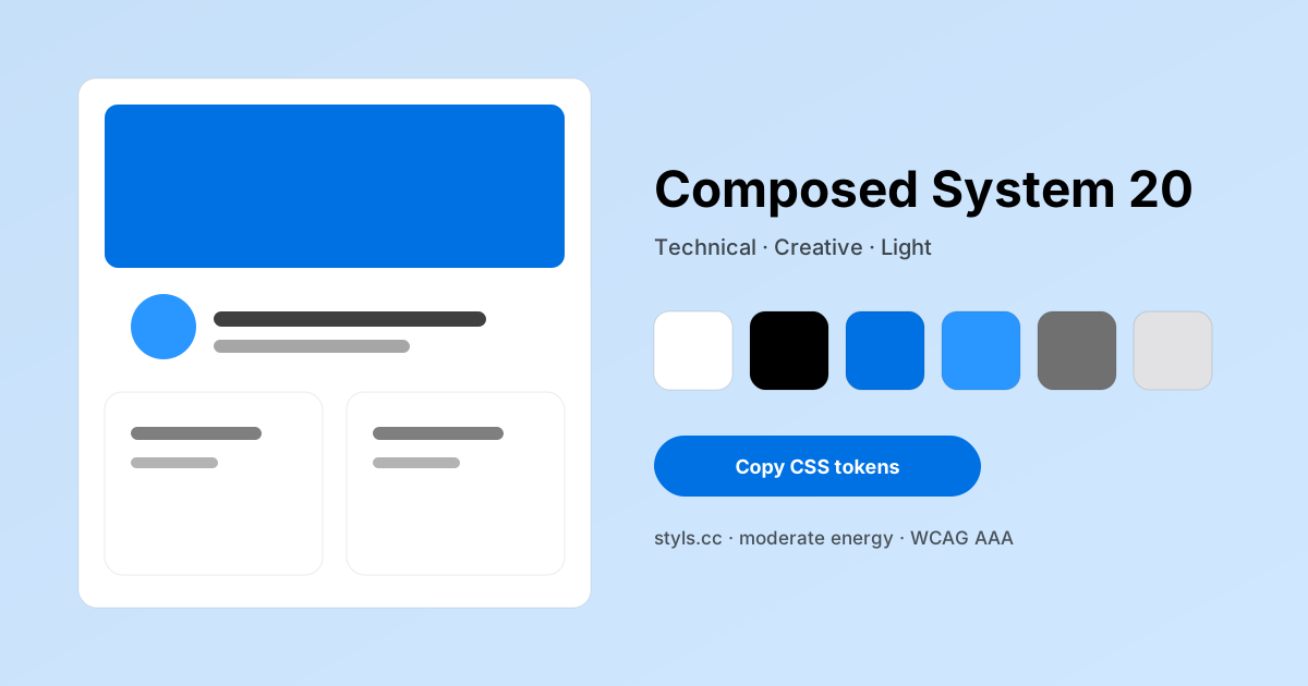
Composed System 20 color palette
6 design tokens with measured contrast against the #ffffff background. Copy the hex values or the CSS below.
- #ffffff Canvas White Background 1:1 · Decorative
- #000000 Charcoal Black Text primary 21:1 · AAA
- #0071e3 Electric Blue Primary 4.7:1 · AA
- #2997ff Highlight Blue Accent 3.02:1 · AA large
- #707070 Cool Gray Secondary 4.95:1 · AA
- #e2e2e5 Border Gray Border 1.29:1 · Decorative
Accessibility
- WCAG AAA
- WCAG AA
- Color-blind safe
- Text on background: 21:1
Contrast improvements recommended
Emotion profile
- technical69
- calm50
- playfulness49
- trust48
- energy48
- human42
- luxury33
Do
- Use consistent spacing
- Follow brand typography guidelines
- Maintain color hierarchy
Don't
- Don't mix warm and cool tones excessively
- Avoid low contrast text
- Don't overcrowd the interface
Constraints
- Max 3 accent colors
- Light backgrounds only
Anti-patterns
- Avoid pure black (#000) for text
- Don't use more than 3 accent colors
- Avoid dark backgrounds
Prompt snippets for AI agents
Paste these into an AI design agent to reproduce the Composed System 20 look.
Design a tech creative light interface using "Apple" style with clean typography and consistent spacing.Create landing page components with Apple color palette. Use #ffffff as primary, #f5f5f7 as accent.Export Composed System 20
:root {
  --background: #ffffff;
  --text-primary: #000000;
  --primary: #0071e3;
  --accent: #2997ff;
  --secondary: #707070;
  --border: #e2e2e5;
}

/* Tailwind (theme.extend.colors) */
module.exports = {
  theme: { extend: { colors: {
    'background': '#ffffff',
    'text-primary': '#000000',
    'primary': '#0071e3',
    'accent': '#2997ff',
    'secondary': '#707070',
    'border': '#e2e2e5',
  } } }
};
Best used for
Source: Apple · Confidence 100%
Related design themes
Apply Composed System 20 to a real project
Open the studio to preview every component, tune the tokens, and export CSS or a Tailwind config.
Open Composed System 20 in the Studio