Bold web color palette
Create a bold web color palette. This page gives you a ready-to-use color system, export code, and a live gradient preview — no design tools required.
Color palette
Bold web color palette explained
The bold web color palette pairs #F472B6 as its primary hue with #FBBF24 as the accent. The palette is balanced for bold aesthetics while keeping text readable against the surface color.
Every swatch is derived from the same two anchor colors, so the web color palette stays harmonious across backgrounds, borders, buttons, and hover states. Copy the CSS below or open it in your favorite tool and apply it immediately.
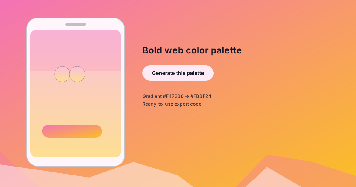
Use the preview image as a starting point for your own mockups. It shows the exact #F472B6 → #FBBF24 gradient applied to a phone screen, a primary button, and a wave pattern so you can see how the bold look plays out in a real interface.
Export code
/* CSS Custom Properties */
:root {
  --background: #fdeaf4;
  --surface: #fef6fa;
  --text-primary: #111827;
  --text-secondary: #7b7783;
  --primary: #F472B6;
  --secondary: #FBBF24;
  --accent: #FBBF24;
}

/* Tailwind CSS config (extend.colors) */
module.exports = {
  theme: {
    extend: {
      colors: {
        'background': '#fdeaf4',
        'surface': '#fef6fa',
        'text-primary': '#111827',
        'text-secondary': '#7b7783',
        'primary': '#F472B6',
        'secondary': '#FBBF24',
        'accent': '#FBBF24',
      }
    }
  }
};